
My Role
Product Designer — User Research, Feature Scoping, Prototyping, User Interface Design, User Testing
Team
Jayson Ong, Design Lead
Mark Ong, Product Designer
Timeline & Status
Apr - Jun 2021 (8 weeks) Launched in Dec 2021
Overview
Following M1 Limited’s announcement of its rebranding and digital transformation, the company set out to introduce a suite of digital tools aimed at enhancing its services.
I played a key role in redesigning their digital point-of-sale (POS) platform for retail operations, empowering employees to deliver faster, more personalised customer experiences.
The redesign was met with high praise from stakeholders and employees alike, achieving a 30% reduction in the sales process steps and at least 40% time savings for customers.
INTERVIEWS & OBSERVATIONS
Employees Feel the POS Platform is Slowing Them Down
To better understand employees’ pain points and expectations, we conducted an in-depth research sprint. This included observing on-the-ground processes and interviewing employees who had used the platform.
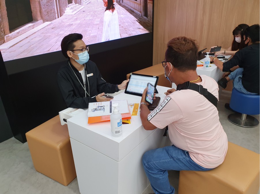
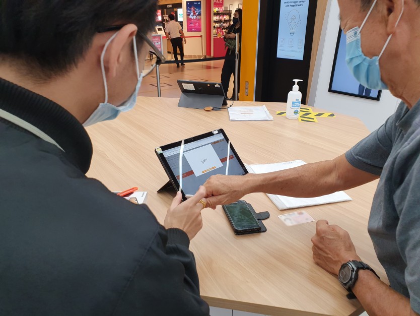
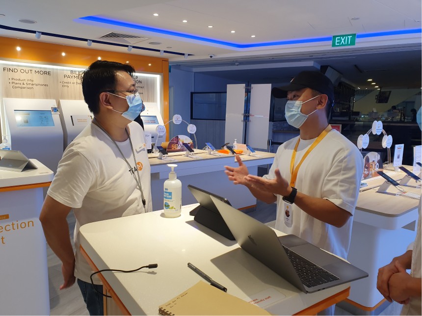
Based on our interviews, employees reported that the new POS system was poorly implemented, introduced unnecessary steps, and caused inconvenience in their current workflows
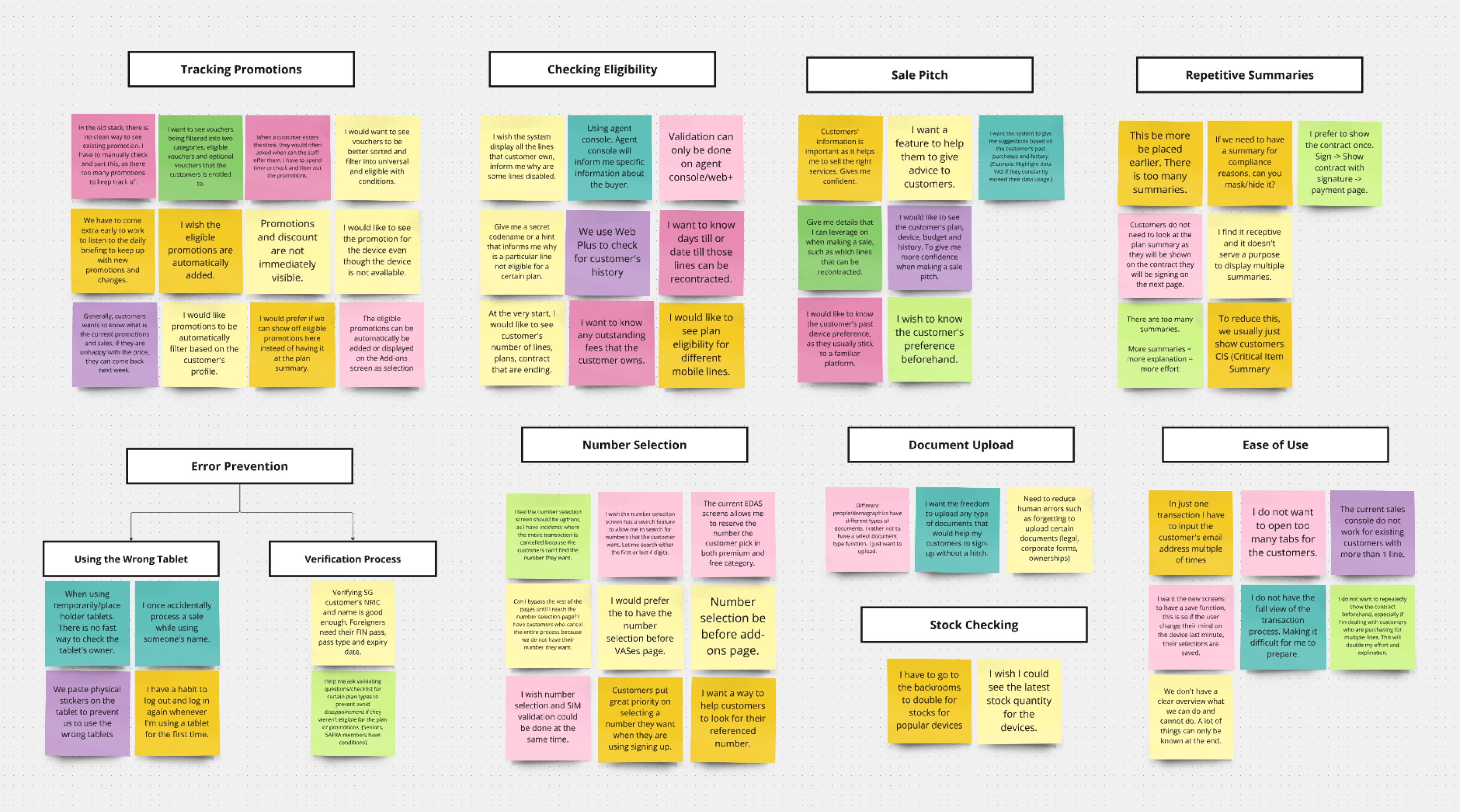
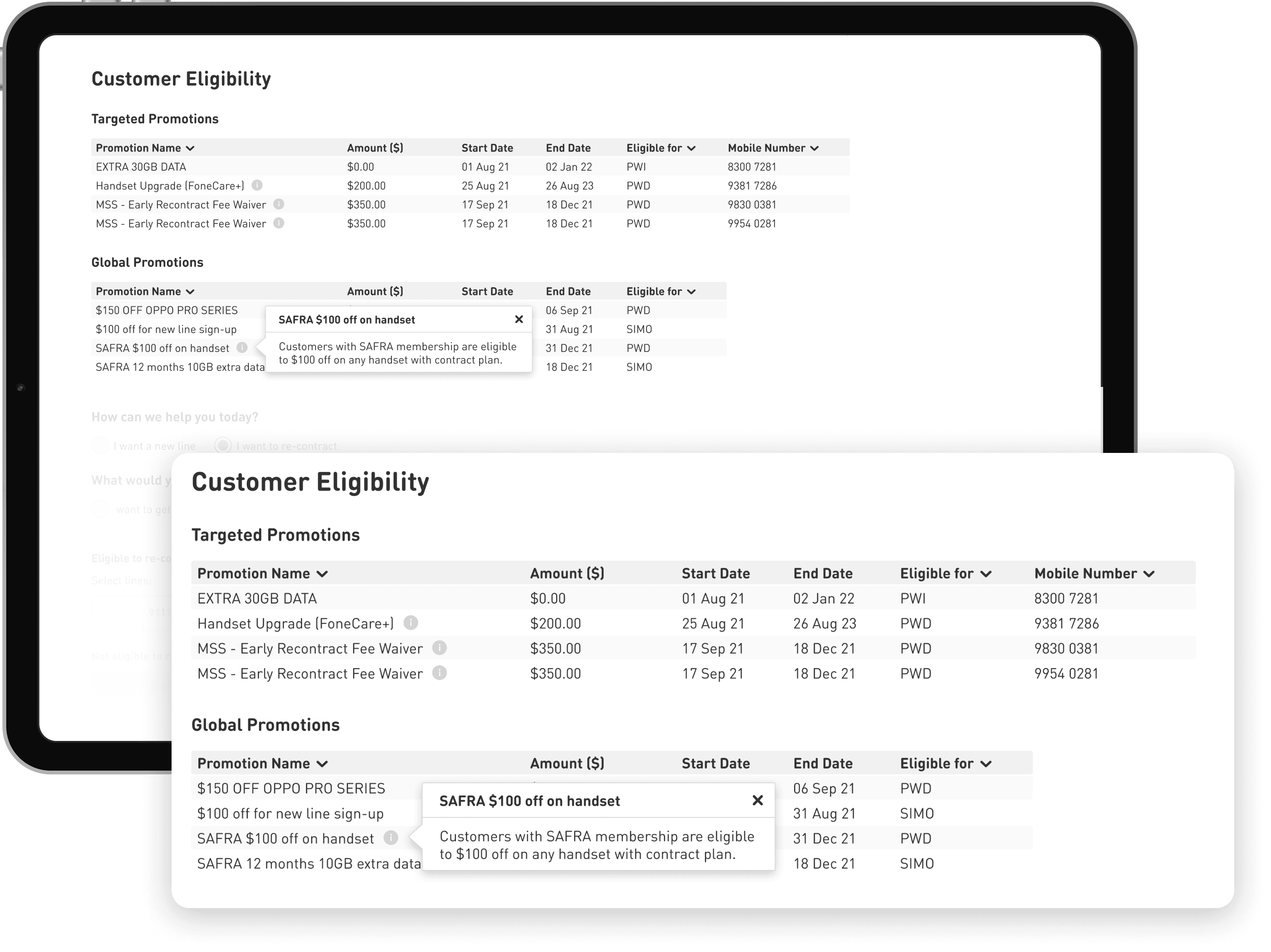
Difficulty Managing Promotions
Employees are required to track the extensive list of promotions and their frequently changing conditions.
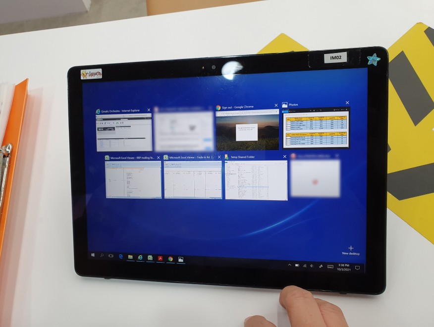
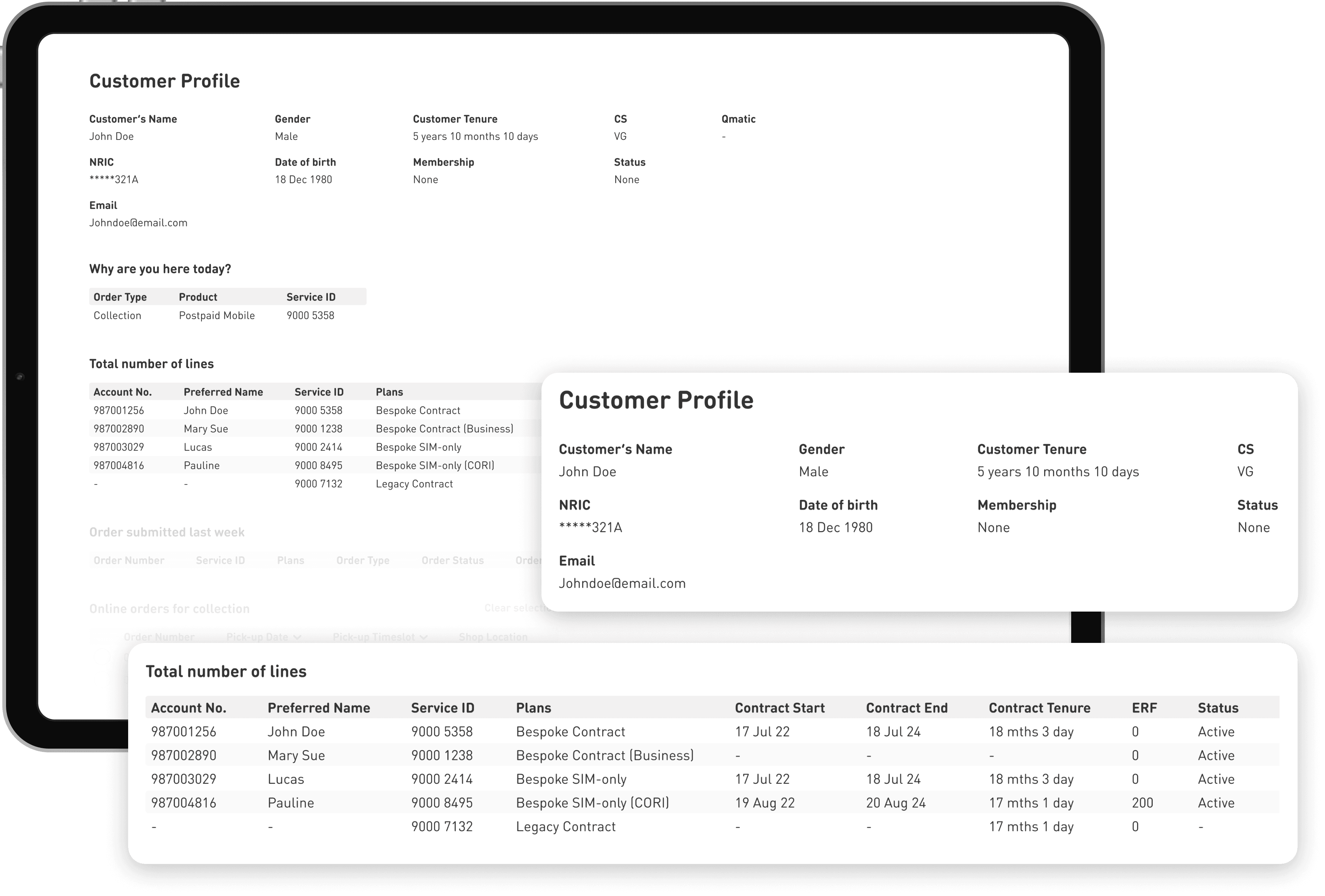
Disorganised Onboarding
Employees had to mentally juggle a laundry list of checks to onboard customers. Many of these critical details are not shown on the platform.
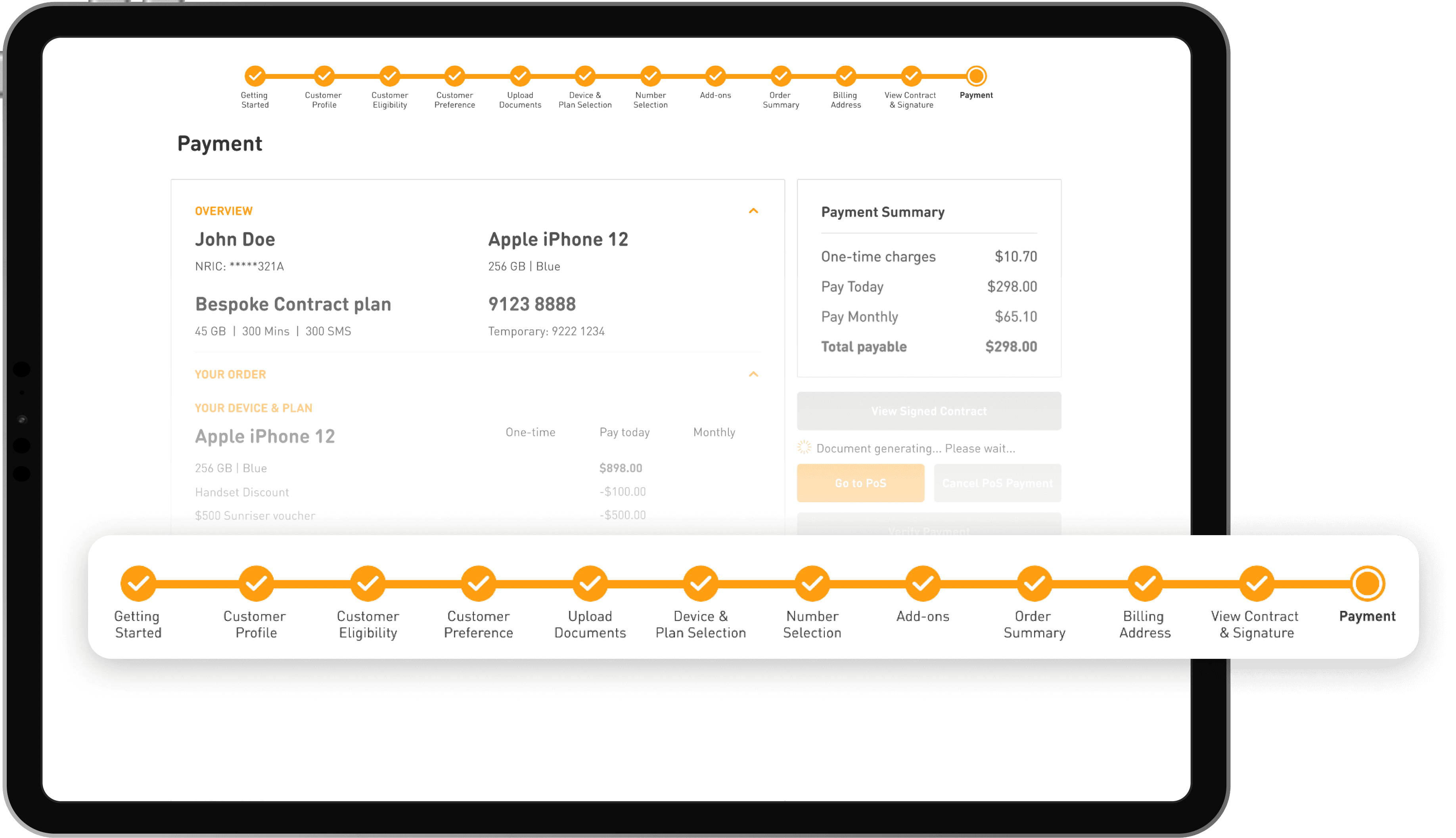
Poorly Optimised Journey
Employees commonly reported that the new transaction process was excessively long and contain numerous repetitive steps.
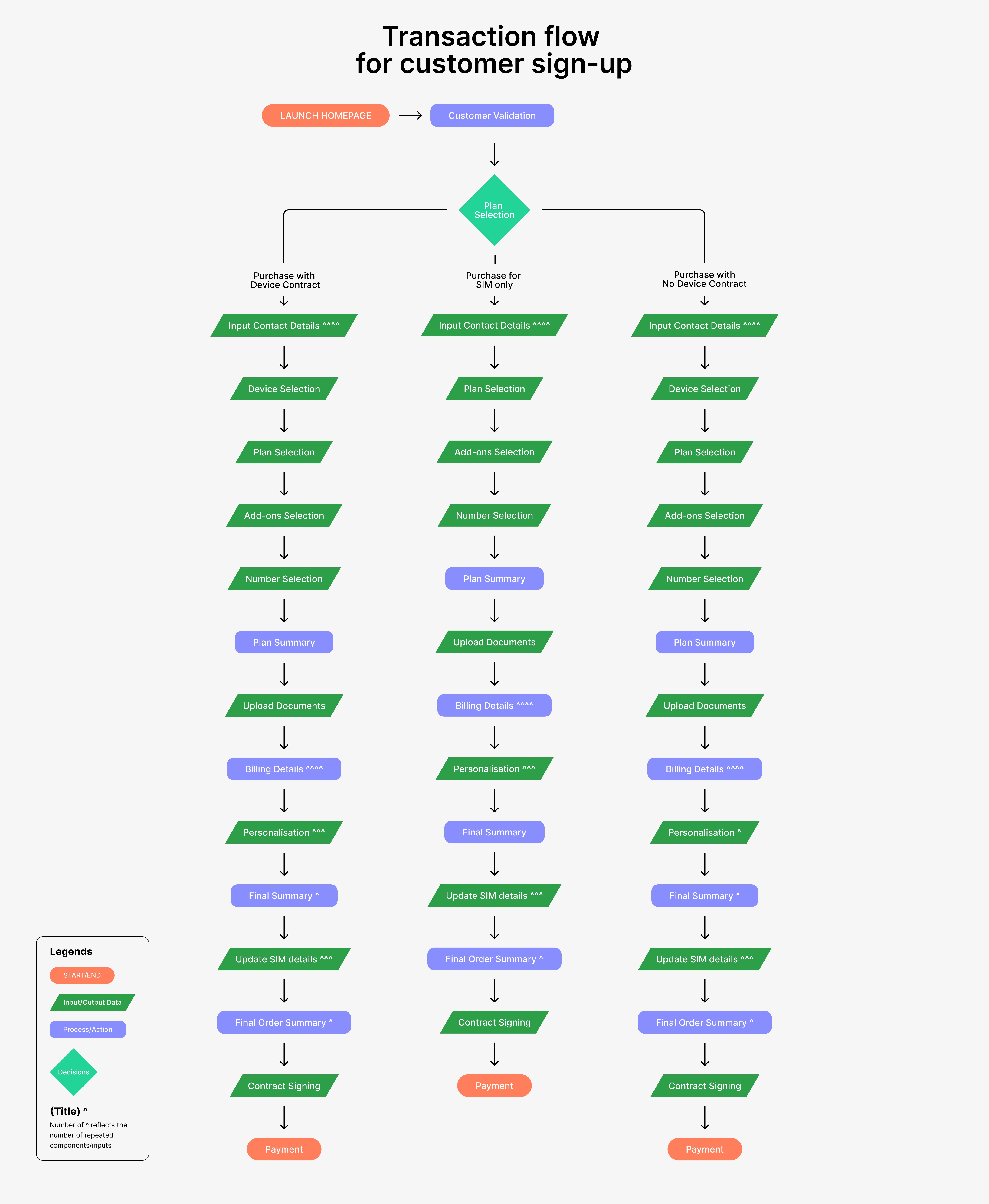
SOLUTION
Enhance Information Accessibility & Improve Platform Usability
With the findings in mind, we focused on redesigning the platform to streamline decision-making, increase information accessibility, and reduce users’ cognitive load.
RESULT
Higher Platform Adoption Rates & Faster Transactions
After completing development and conducting thorough internal testing with users, the redesigned sales platform was launched in November 2021. The feedback from employees was overwhelmingly positive, with 87.5% of employees indicate a preference for the redesign.
The redesign resolved usability issues, reduced transaction times for customers, and provided employees with better access to information. This enabled employees to create more value-added opportunities, contributing to overall revenue growth.
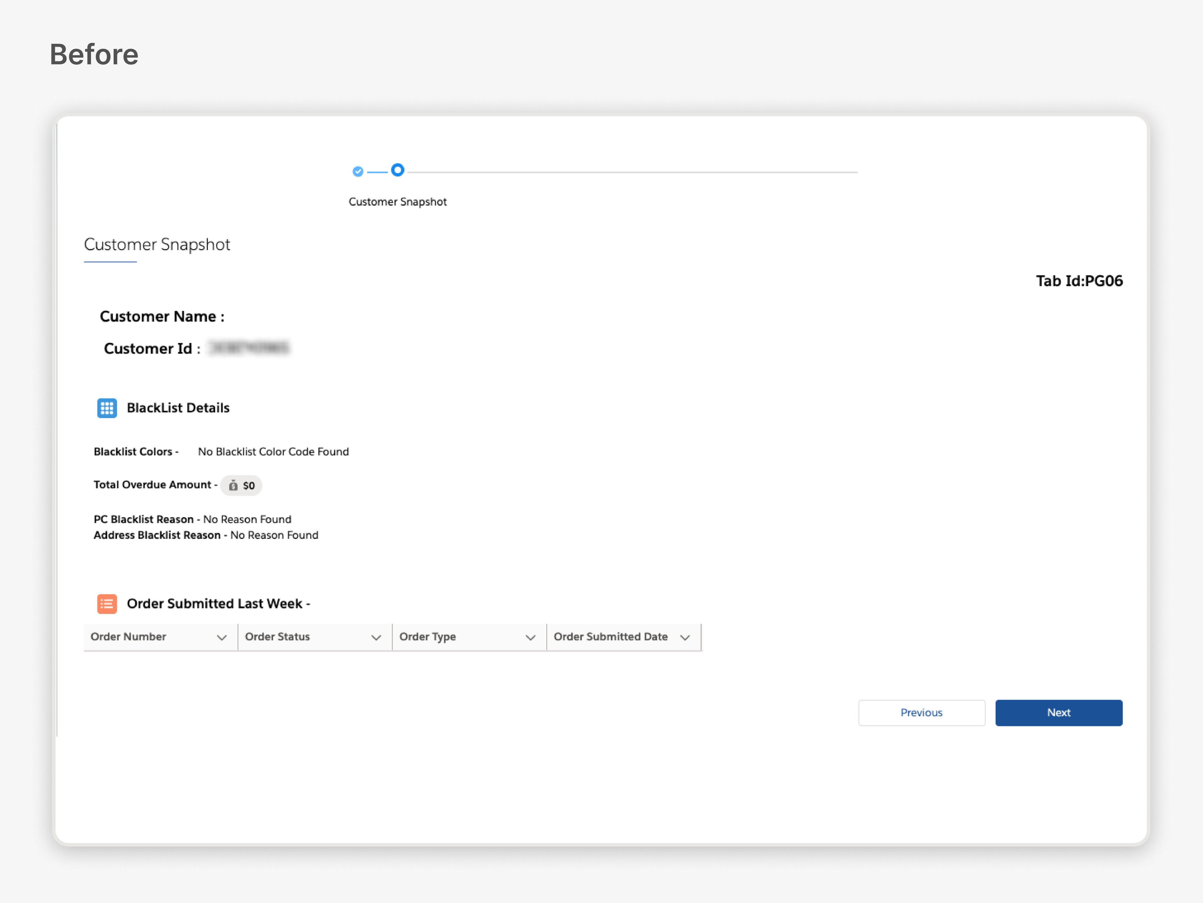
Before
17 steps
To take finish an end-to-end transaction on the platform
6 mins
To complete an end-to-end transaction
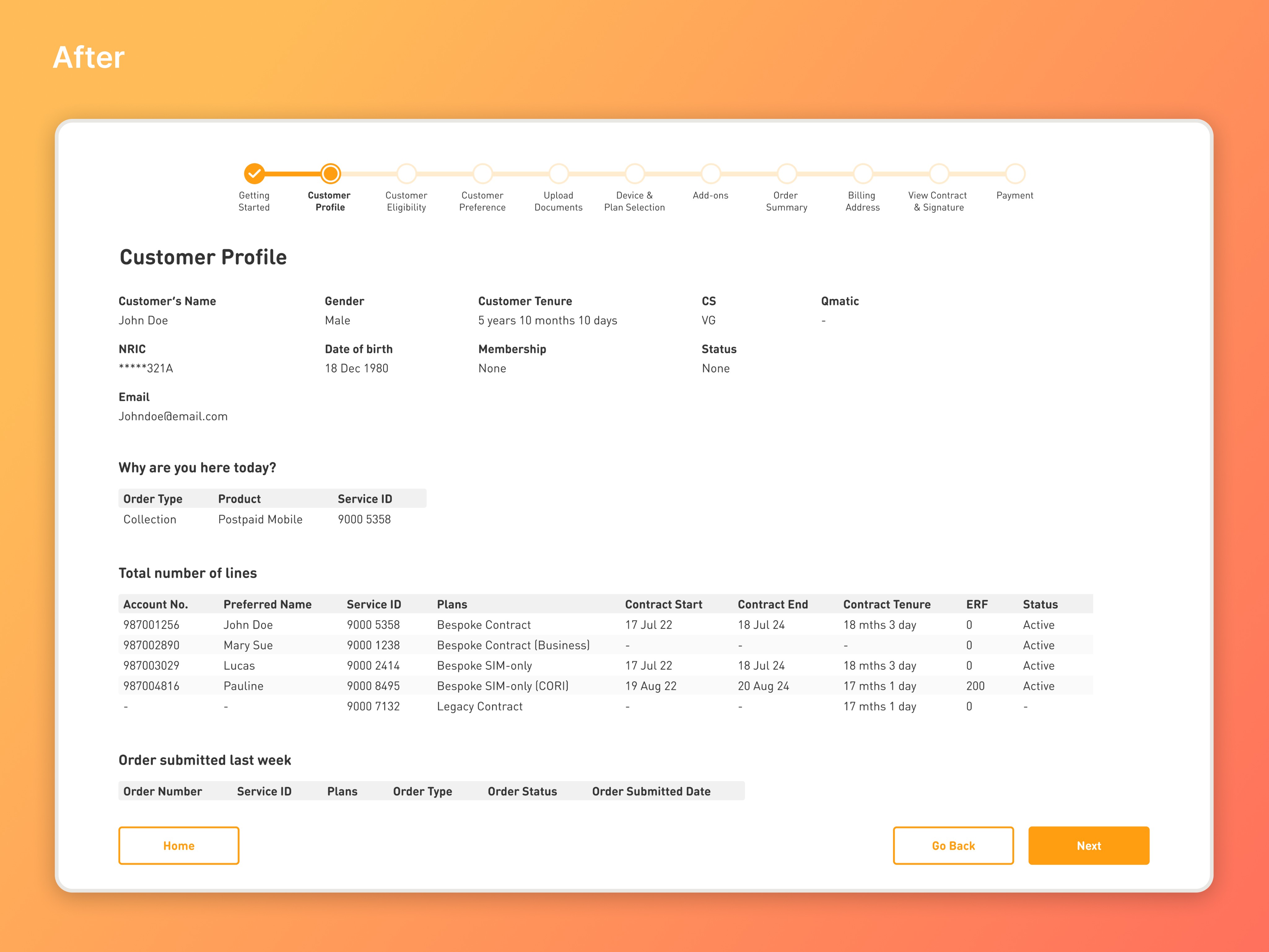
After
12 steps
To take finish an end-to-end transaction on the platform
1.5 mins
To complete an end-to-end transaction
REFLECTION
Learning Experiences & Takeaways
Respecting Legacy Systems
Legacy systems, despite their usability issues, often exist due to historical decisions, backend limitations, and compliance requirements. I learned the importance of balancing innovative design with these constraints, viewing them as opportunities for creative problem-solving rather than barriers.Designing for Expert Users
Designing an interface for expert users required a focus on technical terms and dense information, deviating from the typical simplicity-for-all design approach. I learned that incorporating tooltips helped maintain accessibility for newer users while catering to the needs of experienced ones.Generating Stakeholders Buy-in
While the platform was designed for retail employees, securing support from management and key stakeholders was equally crucial. Their involvement streamlined the design process, provided valuable insights, and ensured that user needs aligned with the company’s broader business goals.

